Hyperlinks: How to format and style them
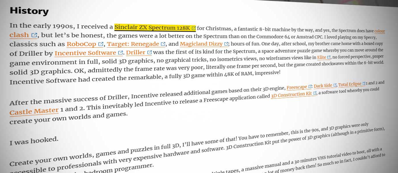
Hyperlinks, or simply, links, are the keystone, the building blocks, the vascular system of a good website. They are critical to helping your users navigate around the website, getting them from one section to another with the least amount of fuss. Without them, users can’t navigate, they get lost, and they move on, so, it’s important to get the hyperlinks to stand out, so they are visible and not easily missed due to styling issues and use.
Having been using the Internet for over 20 years, I’ve seen many web styles and formats being used for hyperlinks. Some have been very good, some good and some are… well, they need improving. With some website designs, the styling of the hyperlinks are only slightly different from the main body text itself, and with the combination with the use of ‘Click Here’, or simply ‘Here’, these hyperlinks are easily missed to the user, which isn’t great for your website usability.
I have written this article to help you with the correct use and styling of hyperlinks, to meet accessibility and usability.
Formatting: Don’t use ‘Click Here’
Hyperlinks, should be part of the natural flow of your written text, and you should never, ever, use the phrase “Click Here” or a variation of it. Although this is a clear ‘call to action’ instruction for a user to perform with the mouse, users do not ‘click’ on a touch screen device like a phone. For accessibility, screen readers and the visually impaired, they too do not use a mouse to click. Also, moving away from ‘Click Here’ is compliant with WCAG 2.1, and Section 2.4.4: hyperlinks should be descriptive
Avoiding the term ‘Click Here’ altogether helps and improves your Search Engine Optimisation (SEO) ranking, either on Google or Bing. Because: users do not search for ‘Click Here’. The hyperlink is also known as the anchor text, and Google wants to see a connection and relationship between the content of the site being linked from, the URL being linked to and the anchor text being used.
In the below example, the anchor text ‘Help Awareness’ literally tells the user exactly what they will get when they activate the link. This is also helpful to screen readers, as it gives context to the hyperlink.
Examples:
Don’t
To find out more about Help Awareness and help raise money, click here.
Reports detailing progress on the previous year’s investment can be found here.
Do
To find out more and help raise money, visit the Help Awareness section of the website.
View the reports detailing progress on the previous year’s precept investment.
Also, do not use the internet addresses as links, e.g.
The papers for this meeting will be published five clear working days before on the Springfield Town Council website, www.springfield.gov.uk/documents/2023/january/PDFs.
Instead, use:
The papers for this meeting will be published five clear working days before on the Springfield Town Council website.
Have the name of the organisation as the hyperlink. All external hyperlinks should be set to open in a new browser window/tab for better usability. If possible, all external hyperlinks should have an icon to indicate to the user that it is an external hyperlink.
Styling the hyperlinks
Hyperlinks should be as visible as possible, in both normal and hover state, to make them stand out to your users. There are various reasons to do this:
- to make them more visible for users who have visual impairments
- when users are trying to find the specific content, users don’t ‘read’ the content on the webpage they ‘scan’ or speed read, so, if your hyperlink stands and is descriptive, this helps the user achieve their goals quicker.
To achieve this, you:
- use a different colour or other visual indications from the main body text to highlight the hyperlink function
- use sufficient colour contrast in the hyperlink hover state to indicate the element is interactive.
Below, in Example 1, the hyperlinks are the same colour as the main body text, albeit in bold formatting, with no other visual cues to indicate to the user there are hyperlinks present within the paragraph, even to visually able users.
Example 1
See the Pen Hyperlinks Tutorial – No.1 by michaeloglesby (@michaeloglesby) on CodePen.
Among the bold text elements within the paragraph of text, only three of them are actual hyperlinks, but which ones? Can you tell by just looking at the text? There are no visual cues or indicators to determine which is which. Rolling the mouse cursor over the bold text is the only way to find out which are hyperlinks, as this changes the mouse cursor itself, but what about users on a mobile or tablet? There are no ‘hover’ states for hyperlinks either. This is bad practice and will frustrate your users.
Hyperlinks should be in a different colour and underlined, AND in a different colour when the mouse cursor interacts with them, known as the Hover state, to make them stand out, see Example 2:
Example 2
See the Pen Hyperlinks Tutorial – No.2 by michaeloglesby (@michaeloglesby) on CodePen.
Making the hyperlink stand out makes the link more visible to users, even to users who are scan/speed reading your content, giving them a better overall user experience.
For my preference, see Example 3, I change a few of the default CSS parameters for hyperlinks. A lot of coders use the CSS ‘text-decoration’ selector for the underlying style, but, I find the border-bottom parameter a better alternative as there is better spacing between the words and the underline.
Also, I add the CSS ‘background-color’ parameter for the a:hover state, for better and more visual impact.
Example 3
See the Pen Hyperlinks Tutorial – No.2 by michaeloglesby (@michaeloglesby) on CodePen.


