If you are a child of the 1980s like myself, the chances are you may have played a Fighting Fantasy book or two, you remember them don’t you? ‘…if you want to go left, turn to page 192. if you want to go right, turn to page 267.’
Today, like many others, I still play ‘fantasy’ but this time in an online virtual world called World of Warcraft (playing a Mage) whereby I do quests and battle demons.
Unfortunately, the demons within the game are rather difficult to defeat, even with the aid of nine other players. So some players of Warcraft have taken it upon themselves to write tactical guides on how to complete the task.
One of the better Warcraft guides’ websites out there is Icy Veins.com. I’ve been a Twitter follower of theirs for a while now, so when I checked my email I was pleasantly surprised to find I’d been sent one from the webmasters of Icy Veins requesting web design help.
I immediately said ‘Yes’.
I thought it would be a nice challenge for myself and also my way of paying back the webmasters for their hard work and efforts on the guides.
There were two main concerns the webmasters wanted me to concentrate on:
- Content navigation
- Guide navigation.
The webmasters also asked for any other web design advice regarding the usability and experience of the site.
Over the course of two weekends (this was a part-time project), I analysed the Icy Veins website with the two key concerns in mind and I wrote a report identifying the issues that I thought needed addressing as well as making recommendations that needed correcting.
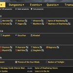
1. Initially, the main content navigation was arranged in an illogical order, which could have frustrated users looking for specific content. Also, the layout of the drop-down mega-menus was cluttered and not spaced in a grid-like arrangement which can give the appearance of looking messy, it was also hard to read.
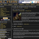
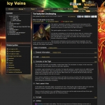
2. The webmasters felt their users were not using the guides as effectively as they could be. They had already been proactive in the problem by creating a guide menu navigation box and they wanted my advice on what would be the best way to display this. I recommended two things: one, place the box on the left-hand side rather than the right due to the F-Model and advert association; the menu would be more visible to the users.
The other recommendation was to display the menu in a + and – accordion arrangement (clicking the + symbol would expand a sub-heading, and clicking – would collapse the sub-heading). This would save space because the total height of the content menu can get quite big.
The other web design advice I gave was mainly cosmetic.
The feedback from the webmasters and the Icy Vein users has been overwhelmingly positive, which is a pleasure to hear. Users of the website are finding the information they need more easily, the user experience has increased and the Likes, Followers and +1’s have also increased, much to the delight of the webmasters.
It’s been a great little project to work on and I wish the webmasters continuing success.
Below, you will find a gallery of mock-ups that I sent to the webmasters of Icy Veins to help illustrate what I was referring to in my reports. Full descriptions are in each photo.
Gallery
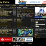
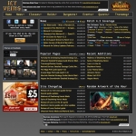
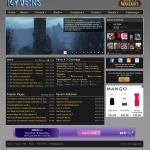
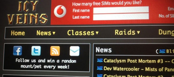
- Icy Veins.com as it appeared before I started work on the site.
- Initially, the mega-menus felt unorganised and cluttered.
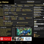
- Version 2 of Icy Veins as it appeared with some quick fixes applied.
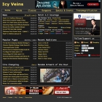
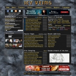
- Version 3 of Icy Veins after the first round of consultations and before user feedback. The background pattern was quickly removed due to negative feedback.
- Final version of Icy Veins with a more cleaner look and feel.
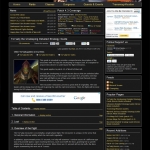
- This is how the raid guides appeared at the beginning.
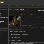
- This is my mock up of what the raid guides could look like, with the guide contents menu box on the left.
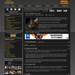
- This is how the raid guides looked after changes being made.
- After aligning, the mega-menus looks and feels more organised.
- A social media sidebar added to the edge of the website to focus the eye on the sharing options; this idea was rejected.
- I was asked to add a 'splash of colour', so I added a background. The idea wasn't used because the web masters felt big background images wouldn't work on high resolution monitors.
- A complete redesign with new logo, jQuery Slider and smaller news box.
© Copyright 2012 Michael Oglesby / Icy Veins.com

